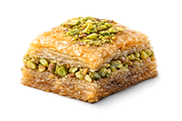
Photography for Baklava: Color, Shine, Texture
Baklava Academy • Article 46 • Updated guide for importers, retailers, and hospitality brands.
Key takeaways
- Color: protect pistachio greens and golden phyllo by using neutral light and avoiding mixed color temperatures.
- Shine: create controlled highlights with soft side/back light—shine without harsh glare.
- Texture: show layers with a 30–45° hero angle plus a macro cut-edge shot.
- Consistency: repeat the same angles, distance, and backgrounds across SKUs to look “export-grade.”
- Speed: a small tabletop setup can produce catalog-ready images in a predictable workflow.
A simple setup that works (no studio required)
You can shoot premium-looking baklava with a window (or one soft light), a diffuser, and a reflector. The goal is soft light that reveals layers and syrup gloss while keeping pistachio color clean.
- Light: window light from the side, slightly behind the product (or a softbox in the same position).
- Diffusion: sheer curtain / diffusion panel to soften shine and prevent “hot spots.”
- Fill: white foam board opposite the light to lift shadows and keep details visible.
- Backgrounds: matte neutral stone, light wood, or warm gray—avoid glossy surfaces.
- Tripod: helps keep angles consistent across products (very important for catalogs).
Lighting: how to show shine without glare
Baklava reflects light because of syrup and butter. If your highlights look like white “burned” patches, the light is too small/hard or too frontal. Use these rules:
- Move the light to the side/back (not straight from the front).
- Make the light bigger (diffuse it or bounce it) so highlights are smooth.
- Underexpose slightly to protect highlights, then lift shadows later.
- Control reflections by changing camera height or rotating the tray a few degrees.
Quick “shine check”
- Shine should look like soft gloss, not a mirror.
- You should still see phyllo texture inside highlights.
- Pistachio should look fresh and green, not gray or neon.
Angles that sell (and what each one communicates)
- 30–45° hero angle: best overall—shows top pattern + side layers.
- Top-down (flat lay): best for assortments, symmetry, gift boxes, and “premium abundance.”
- Macro cut-edge: best for flake detail, pistachio density, and “crunch.”
- Packaging hero: essential for export buyers—front label plus a clean product preview.
Styling: clean, premium, and export-friendly
Export buyers want clarity, not decoration. Use styling that supports the product and keeps the image “truthful.”
- Keep props minimal: one small glass tea cup, a coffee cup, or pistachios in a small dish (not both).
- Show scale: include one piece on a small plate or fork for size reference.
- Highlight pistachio: sprinkle a small amount only if it matches the real product spec.
- Keep crumbs intentional: a few flakes add realism; a mess looks like poor handling.
Color: keep pistachio green natural (not gray, not neon)
- Avoid mixed light: don’t combine window light with warm indoor bulbs.
- Neutral surfaces: strong colored backgrounds can shift pistachio color.
- Protect highlights: pistachio color looks better when highlights aren’t blown out.
- Consistency: use the same white balance approach across all SKUs.
The export-ready shot list (use this as your standard)
- 1) SKU hero: tray/box at 30–45°
- 2) Texture close-up: cut-edge macro showing layers + nut fill
- 3) Assortment layout: top-down (especially for mixed boxes)
- 4) Packaging front: label clearly readable
- 5) Packaging back: ingredients/allergens/nutrition panel visible
- 6) Portion shot: single piece on plate with fork (scale)
- 7) White background: marketplace-friendly clean cutout-style shot (simple lighting + clean backdrop)
Common mistakes (and quick fixes)
- Looks greasy: diffuse the light more, move it slightly back, and reduce highlights.
- Looks flat: add side light + small reflector, increase shadow separation.
- Pistachio looks dull: correct white balance, avoid yellow light, protect highlights.
- Phyllo layers not visible: shoot at 30–45°, include a cut edge, and keep the front layer sharp.
- Inconsistent catalog: lock camera position + background and repeat the same angles for every SKU.
Post-processing: keep it premium, keep it honest
A little editing is normal, but over-editing kills trust for export buyers. Aim for clean, consistent, and realistic:
- Adjust white balance for neutral color.
- Reduce highlight blowout to preserve syrup gloss detail.
- Lift shadows slightly so texture stays visible.
- Sharpen lightly—too much sharpening makes syrup look artificial.
Related reads: How to Store Baklava in Retail Displays • Export Packaging • Baklava Pairings

